japersonal
Active member
@Audentio, I also found out that if you enable the feature "Show Forum Descriptions on Node List" and keep "Enable Forum Descriptions Tooltips" disabled, from Style Properties: Forum / Node List, the alignment will fail if the the number of lines of the tooltip on one of the nodes does not match the number of lines of the one beside it.
For instance:
[Node One]...........[Node 2]
Line 1....................Line1
For instance:
[Node One]...........[Node 2]
Line 1....................Line1
Line2
")

 I guess we may have to wait on a reply from @
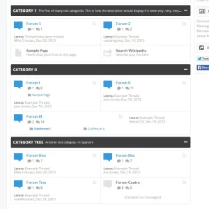